Design System
Colors
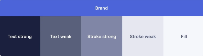
- brand
- light (#4F6AF3)
- dark (#7286F9)
- fill
- light (#F5F7FB)
- dark (#101322)
- text.strong
- light (#141833)
- dark (#F0F1F7)
- text.weak
- light (#545973)
- dark (#A1A5C1)
- stroke.strong
- light (#7D83A3)
- dark (#4C516A)
- stroke.weak
- light (#E1E2ED)
- dark (#2A2D40)
Typography
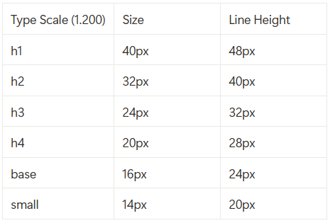
Font Size Type scale is a simple and logical way to create a set of balanced font sizes that work well together.
Here are some popular type scales, ordered from smallest to largest:
- 1.067 – Minor Second
- 1.125 – Major Second
- 1.200 – Minor Third
- 1.250 – Major Third
- 1.333 – Perfect Fourth
- 1.414 – Augmented Fourth
- 1.500 – Perfect Fifth
- 1.618 – Golden Ratio
I am picking 1.200 as my type scale. So here is our pre-defined font sizes rounded off for simplicity.
Typeface
Use two typefaces at most.
It's rarely necessary to use more than two, and it might make the design feel visually confused.
Use a single sans serif typeface for interface design, as they're generally the most legible, neutral, and simple.
I'll go with Inter from google fonts.
Font Weight
- Use regular and bold font weight only.
- Use bold for headings to emphasise them.
- Use regular for other small test.
Spacing
Using limited, predefined, and consistent spacing options will also result in a neater, simpler interface design that's faster to build.
Use 8pt (8 pointer grid system). Many popular screen sizes are divisible by 8 and it provides a bit more spacing flexibility than using 10 point grid.
- xs: 8px
- sm: 16px
- md: 24px
- lg: 32px
- xl: 48px
- xxl: 80px
2 Shadow Options
You'll generally need only 2 shadow options (raised and overlay) to indicate the depth of interface elements.
Border Radius
Create 3 border radius options (8px, 16px, and 32px) to use on small, medium, and large interface elements respectively.
Use space to group related elements
Make outer padding the same or more than inner padding. Elements that are more related should be closer together.
The element inside a container are more related to each other than they are to the container itself.
- Place related element in same container.
- Space related elements closer together.
- Make related elements look similar.
- Align related elements in a continous line.
Make horizontal padding twice the vertical padding in buttons
If you want people to recognise and element as a button, it's good idea to follow this pattern.
Create a clear visual hierarchy
Present information in order of importance by making more important elements look more prominent.
This is my design system, I'll keep updating it and components as I learn more about building UIs.